CU Mart: 5 Charming Ways the South Korean Convenience Store Steals the Hearts of Malaysians Through Its Branding
Dear fans of South Korean culture,

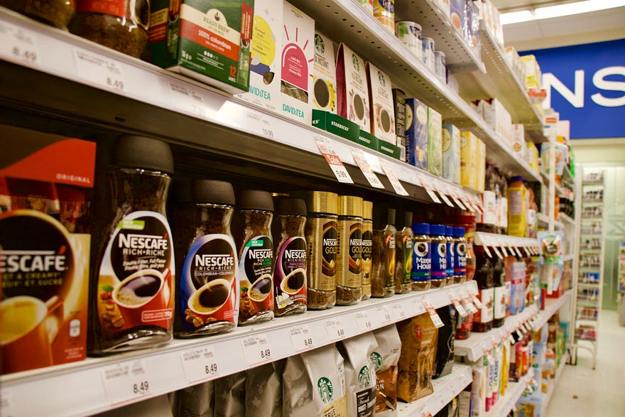
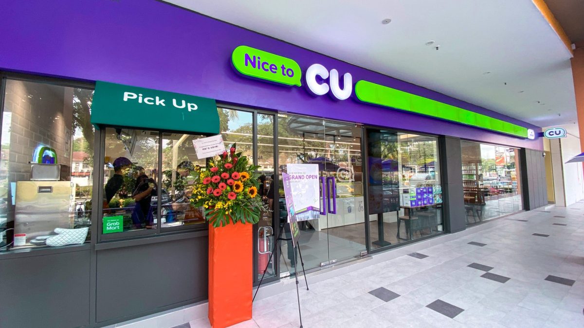
CU Mart is a popular convenience store in South Korea. Courtesy of fiffy_natasya via Instagram. Photo by Charles Gao on Unsplash
Did you know that the first CU Mart was first established in 1990? That’s almost three decades ago. Today, the Korean convenience store famous for its fast food and Korean snacks can also be found in Malaysia: Within less than a year, it has successfully opened 50 stores, with plans to expand to 500 stores by 2027. That’s quite scary competition for Japan’s Family Mart, especially due to the history behind CU Mart— which was partially founded for the purpose of replacing Family Mart in Korea to keep their money within their own country— and CU Mart succeeded at taking over Family Mart in Korea, as there are no longer any Family Mart stores in South Korea.
Now that both competitors find themselves face to face in Malaysia, might it be too soon to tell who will be staying for the long run?
The fact is that Family Mart and CU Mart have more similarities than differences. For example, both offer soft serve ice cream and fishcakes in broth (oden in Japanese and odeng in Korean), and both feature a range of products from packaged snacks, pastries, hot food to-go, and instant meals.
Nevertheless, they remain vastly different in terms of how they brand themselves, each appealing to a different side of the consumer’s mind. Not necessarily appealing to different types of consumers, but to different parts in us that may seek different things at different times. Let us explain how CU Mart cleverly caters itself to a unique sample of people.
Generally, the target audiences of convenience stores would include everybody located within its geographical region who value convenient access to everyday items, but CU Mart has gone deeper in specifying who it wants its consumers to be.
In our opinion, this ambitious Korean convenience store captures— you’ve guessed it— fans of Korean culture. This targeting is apparent in the way they ensure their stores play K-Pop music and in the way the overall look of their stores resemble the ones in Korea, so much so that it’s impossible to not feel like you’re in Seoul…which brings us to share with you 5 Ways CU Mart focuses on promoting its brand image as a strategy, targeting fans of South Korean culture head on.
1. Modern Store Design

CU Mart’s spacious entrance and cashier testifies to the importance of space in design. Photo by Alex Mao on Unsplash
Enter any convenience store in South Korea and you’ll start to be able to differentiate between Korean convenience stores and the ones in other countries. Unlike even Family Mart, their cashier table features a countertop that’s much more spacious, making you feel comfortable as a customer, since spacing in-store machines further away from where worker-customer interactions take place allows such interactions to be focused on more easily.
Similarly, another way CU Mart prioritizes space is in how they dedicate a generous entrance for those walking into their store— unlike Family Mart stores which always greets you immediately with a shelf of items, presumably resembling how the Japanese culture values making use of space as much as possible.
However, we believe CU Mart has made the better decision here because clutter and cramped spaces can instill feelings of tension and discomfort, which may in turn affect customer purchasing decisions. Instead, customers of CU Mart are likely to feel welcomed as they make their way into its roomy entrance and pay for their desired items at the minimalistic and uncrowded counter.
Space is also important if you’d like to design effective landing pages and websites, more specifically, white space, which simply refers to the empty space surrounding elements of a page (words, pictures, buttons), be it on print or digital media. Without white space, your website, email, or landing page will appear cluttered, unimpressive, and difficult to navigate.
2. Simplified Menu

As a convenience store that also sells food, CU Mart keeps its options simple, possibly to save people’s time. Photo by Nathan Dumlao on Unsplash
Whilst the Family Mart menu presents you with a whole list of options just when it comes to drinks alone, the drinks options at CU Mart are much more straightforward, with no complicated drinks that require many steps such as bubble tea. Instead, all their drinks can be pumped right out of their machines.
In addition to a simplified drink menu, their food system too is made easy, with smaller shelves and a smaller selection of items than Family Mart— because they want you to grab a pastry or quick meal, a drink, and be on your way to wherever you need to be— by doing so, they are staying true to the definition of what a convenience mart is: not a place to be distracted and linger around for a long period of time just for the purpose of choosing what to buy, but to grab and go.
3. In-Store Experience: Relevant Music (You’re in Seoul!)

Now that CU Mart’s here, everyone can feel like they’re in Seoul. Photo by Ciaran O’Brien on Unsplash
If only Family Mart would turn on some Japanese tunes in their stores because what CU Mart has done makes a big difference. When you’ve got music from K-pop and K-drama in the background as you shop, you can’t help but feel like you’re in Seoul, and you feel as if you’re on holiday, all in all, a novel shopping experience is created by just adding music.
4. Brand Colors

When it comes to colors, a few simple decisions require much planning. Courtesy of Tinker Society
Another obvious branding strategy on behalf of CU Mart is how the colors purple and green are smoothly integrated into their shop design, from store sign, interior walls, light paneling, chairs (at some locations, they’re white, purple, or green), and brand logo.
The color green represents qualities such as freshness, calm, and serenity, which is great since to “always be with you as you start off the day, take a break in between, and refresh for the next day” is exactly what CU Mart aims to deliver. As it works on its mission to continue being the industry leading 24/7 convenience store in Korea, CU Mart knows how big a role color plays in putting together a masterpiece of a store and brand.
What’s fascinating is that they’ve also picked white and purple as their brand colors, which are typically popular brand colors within the healthcare industry. White denotes cleanliness and purple stands for elegance and richness. When white, green, and purple come together in a logo, you’ve got a company that promises to prioritize health, freshness, cleanliness, and elegance in everything they provide customers.
For ideas on how you can craft your own meaningful brand logo to be featured across various marketing channels, reach out to us. Alternatively, check out this logo we designed for a mall and another one we did for an event management company.
5. K-Pop-Inspired Beauty products

Offering a range of beauty products in a convenience store means you’re now catering to a wider audience, encouraging more kinds of people to enter your store. Photo by pmv chamara on Unsplash
Sure pharmacies have these, but for a small convenience store to offer makeup, skincare, masks, lip balm, moisturizers, and lotions from the heart of South Korea, this sets CU Mart to be known as the convenience store that not only wants to help people grab food on the go but also cares about helping people stay clean and looking fresh — essentially their brand values as demonstrated by their brand colors.
The question now is what can your brand add to your existing product range or marketing approaches that could make it speak out for your brand values even more?
Takeaway
Whether or not you’re a convenience store, there sure are a couple of lessons you can take away from CU Mart’s success.
To rap it off, keep your design modern and spacious (even when it comes to designing a landing page), keep product options to a minimal (the keyword here is convenience), add to the customer experience by blasting relevant tunes in-store, put time and thought into choosing brand colors, and diversify your product range (hint: what were your brand values again?).
Everybody needs a little help now and then. If you’re in need of some help determining your brand colors or in clarifying your brand values, image, voice, or personality, we’re always here for you, so feel free to reach out to us.


